Cracks in the Carapace of Fame
Barry Miles
Author, Counterculture Historian
Featured in Measuring Elvis, 2015
This text was the foreword to the catalogue accompanying Fowler’s solo exhibition at Dadiani Fine Art, Cork St, London, in 2014-2015. The exhibition was curated by James Birch, renowned for his innovative championing of British art.
To me, the sign of a true artist is their ability to draw. It is the fundamental creative act, as practiced for the last 40,000 years. To quote Matisse: “Drawing is like making an expressive gesture with the advantage of permanence.” Nina Mae Fowler is a drawer, albeit a very painterly one. She works in monochrome and does not care much for colour so we are unlikely to see Hockney-style Fowlers. Her pallet ranges from the deepest inky blacks — Hollywood noir, impenetrable shadows, the vault, death — to luminous shades of white — reflections, highlights, the shine of hair oil, the spotlight, the star illuminated — because in addition to a huge range of pencils, chalks and conté, she uses a large collection of rubbers (‘erasers’ to delicate Americans) “I use rubbers almost as much as I use pencils,” she says. “I draw with the rubber.” The result is a subtle, often painterly, surface modulation sometimes picked out with exquisite detail, like the facial features of a Tiepolo drawing. Mistakes are harder to correct in drawing than painting (except water colours) because the deeper layers show through. Unless your style is particularly scribbly, you have to have a sureness of hand and considerable skill. There can be no trickery. As Salvador Dali said, “Drawing is the honesty of the art. There is no possibility of cheating. It is either good or bad.”
Nina’s subject is fame and its underside: the artificial construct of Hollywood glamour, the tawdry attraction of Tinseltown in contrast to the inner lives of the stars: their personal torments and demons, traumas and tragedies. Her subjects have ranged from Elvis Presley to bullfighters, crooners to tabloid celebrities, but most of all it is the stars of early Hollywood that have fascinated her; all areas where the individual is accorded an iconic presence that often bears little resemblance to the real person beneath, also areas where the public have a prurient interest in their fall from grace.
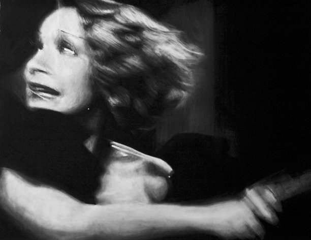
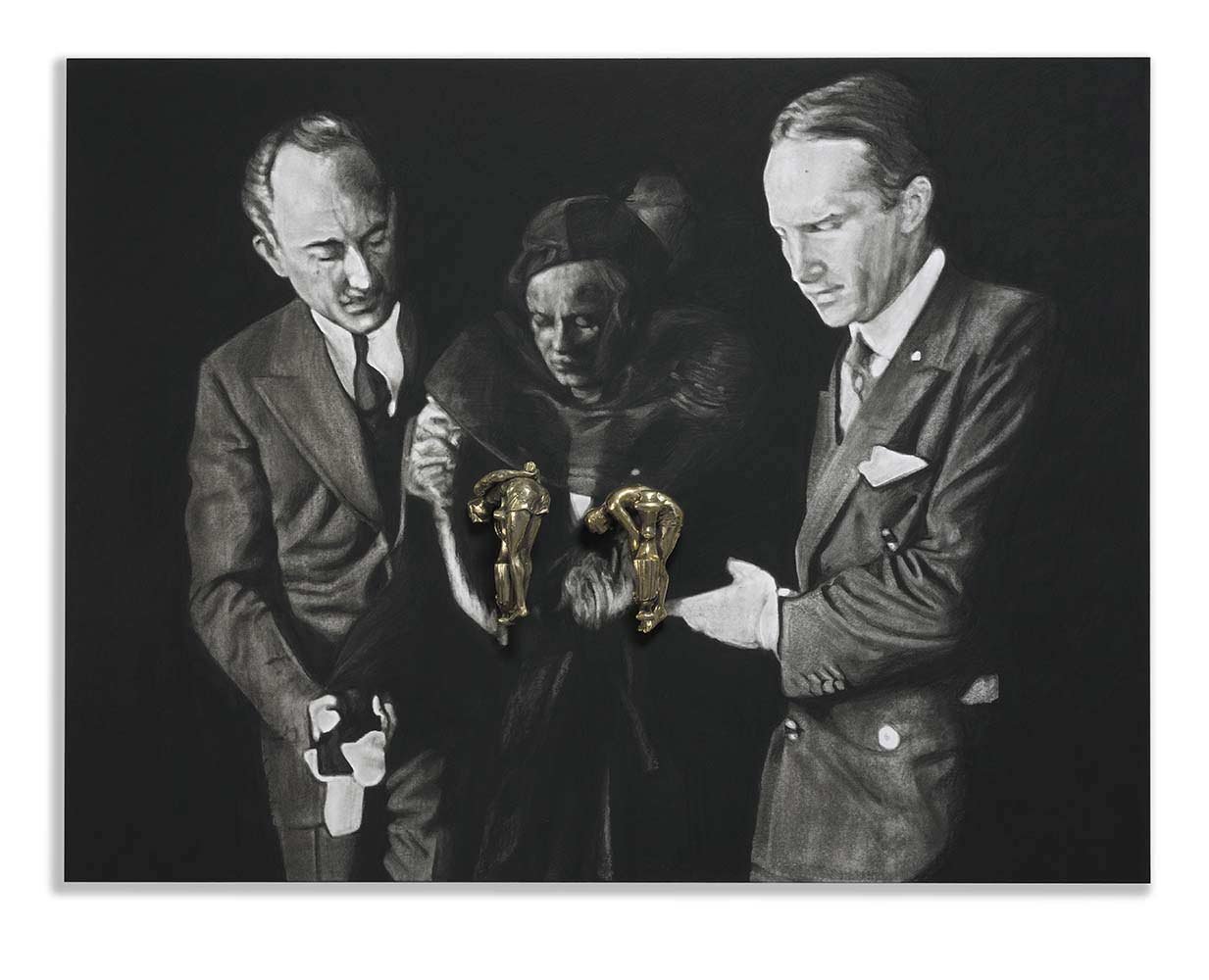
For his masterpiece Kaddish, the American poet Allen Ginsberg looked for the rhythms of deep emotional expression, wailing, crying, states of extreme stress in American speech. Nina finds a visual equivalent in celebrities under duress. She is interested in the edge: the cracks in the carapace of fame; the breaking point where the iconic presence is no longer sustainable and glimpses of reality seep out; Hollywood stars are depicted at their most vulnerable or stressed; the star is revealed as an actual human being. In Jean (Knockers III) a shattered, 20-year-old Jean Harlow is shown being escorted from the funeral of her husband, Paul Bern: he was unable to take the pressure of being ‘Jean Harlow’s husband’ and shot himself in September 1932. In a large-scale work, They Took Away My Veil: Parts I - VIII, based on the climactic finale of Edward Sheldon’s 1933 The Song of Songs, Marlene Dietrich wealds a sledgehammer to destroy a life-size sculpture of herself made by an ex-lover. The received image of Marlene Dietrich: the fabulous cheekbones, the unbelievable eyebrows, unsmiling against a Hollywood noir background, is shattered by the violent physicality of these images, which also, of course, comment on the nature of fame and the Hollywood star as an object of desire.
Nina Mae Fowler is a master of time and space. Her images and sculptures usually have their origin in appropriations from photographs, mostly frame-grabs from silent era Hollywood films. All photographs freeze time, but none so much as film stills which are timeless, in contrast to the very form of film, which is a fixed, controlled passage of time. Drawing slows down and expands the act of seeing; in drawing, an artist, by the very nature of the medium, looks more intently and sees more than anyone else. Time is slowed, literally drawn-out. By drawing from a photograph we already have multiple layers of meaning which gives to the central image or images (but not to the usually neutral background) what Walter Benjamin calls a ‘thickened surface’, an image far removed from its source and all the philosophical inferences that can be drawn from that (the artificiality of the original photographed event, the nature of mechanical reproduction, art from everyday objects: Warhol, choice of classical medium, etc.). The images themselves are also enhanced, cropped, divorced from their background. Nina’s subjects are frequently caught in the spotlight; it is a signature of her compositions that the upturned faces of the principals are highlighted for added drama and energy. Contrasts are heightened. Her large multi-figure compositions usually feature strong lighting, illuminating the subjects of the piece just like their originals on the sound stage.
Nina trained initially as a sculptor, and there is a three-dimensional awareness in all her work: drawings will sometimes have frames made from low relief figures cavorting around the edge. Her images exist in their own space: hung from eyelets to define their physicality; the drawings are often of odd dimensions with bits sticking out the side, and these she sometimes presents in frames that are cut to the same shape as the drawing, to emphasize the exact dimensions of the image. Sometimes she disrupts the picture plane by lifting part of the image, like a flap, so that it leaps out into three-dimensional space; or a statue is placed alongside that echoes the subject and is part of the composition.
A good example of the intrusion of the drawing into three-dimensional space is her Knockers series, where, using the slang term ‘knockers’ for breasts, she attaches actual door-knockers to the drawings in the approximate position where the nipples would be. The brass door-knockers, each one different, were inspired by a series of survival training photographs of US Navy Seals: hands tied, wearing only protective goggles which hid their faces, they were plunged into water and had to struggle to the surface. The juxtaposition of these oversize glamorous icons — seemingly powerful women — and the small struggling men, reduced to door-knocker size, is counteracted by the fact that US Navy Seals are some of the fittest, best trained, and most-likely macho men on Earth, contrasted, in the case of Jean (Knockers III) with Jean Harlow at her most vulnerable. As usual with Nina Mae Fowler’s work, all is not what it might seem. The brass figures boldly protrude from the surface, metallic and coloured, revealing the fact that the deep picture plane is illusory.
Cinemas used to have showcards in glass frames advertising upcoming attractions under the headline “SOON”. Nina has appropriated these for a series of works in which the word ‘Soon’ has sinister undertones of impending disaster. In Soon: Johnnie Ray the American crooner is shown performing one of his emotional ballads. The press nicknamed him Mr. Emotion, the Nabob of Sob, or the Prince of Wails.
His big hit was Cry, and his fans all waited to see him cry on stage — he would fall on his knees, tear at his hair and sob. They paid to see him enact an emotional breakdown (though they knew he was deaf, few of them knew he was also gay and an alcoholic). His ‘brand’ was his vulnerability. Nina shows him in this role, his face of pain, his hair disheveled.
On September 26, 1984, the Spanish bullfighter Francisco Rivera Pérez, known as Paquirri, was gored by a bull known as ‘Avispado’ in a ring in Pozoblanco, Cordoba. Bullrings have emergency medical facilities, and the families of injured fighters are permitted to watch through a screen while emergency operations are performed. The picture used in Soon III: The Death of Paquirri was taken about half an hour before he died of his injuries. While Nina would never dream of wanting to watch an operation of someone involved in a car crash, this is an image directly resulting from the underside of the theatrical, macho theatre of the bullring. It is the dark side of the spectacle, the unspoken, omnipresent possibility that the torero might die, the traje de luces, the suit of light, be bespattered with blood.
She Shoulda Said No (title taken from a 1949 exploitation film by Sam Newfield under the name of Sherman Scott) is the third in her series of drawn montages following on from Valentino’s Funeral (2009) and A Real Allegory: Parts I and II (2011). The six seemingly disparate images were gathered over the years from a variety of sources, until they coalesced to form a whole. The overall theme is dance, though She Shoulda Said No (James) is of James Dean swinging down a rope to talk to a man below in a screen grab from East of Eden — but they could well be dancing. It is this ambiguity that gives the image its edge. But the young Margot Fonteyn is dancing, and She Shoulda Said No (Let’s Dance) perfectly captures the somewhat awkward moves of the Twist.
Large-scale pencil and graphite drawings are labour intensive and Nina often employs a studio assistant to fill in the deep black backgrounds. This process is revealed here by leaving some of the background unfinished. In She Shoulda Said No (Let’s Party) her assistant had filled in all around the main figure and was working outwards. When Nina came in one morning and saw it in its unfinished state she was struck by the accidental tonal balance achieved by the white area on the right and the horizon, or golden-section break, that more or less followed the outline of the figure. She decided to keep it as it was, complete with test marks to try out different pencils. Once more, the picture plane is disrupted, emphasizing the figure’s efforts to keep on dancing. She Shoulda Said No (Work In Progress) and She Shoulda Said No (You and Me) have in common the unfinished state of their backgrounds. In the latter case, there appears to be an intentional balance of forms but it is in fact an accidental one.
Another feature of Nina’s work is the cut-out. “People were often shocked when I cut away all that work, because they know how long it takes to do,” she remarked. But compositionally she finds it adds drama and energy to an image to extend it beyond the normal limits of the frame, or to echo the thrust of the composition, as in She Shoulda Said No (Work In Progress). By making the individual elements of the montage unusual shapes, the overall arrangement becomes more complex with eye-lines that extend right across the pieces. This is further amplified by the framing process, always an important element in her work.
The figures in these latest pieces (2014) stand alone. The backgrounds are either black or uncompleted black, with no details, no dance- floors or interiors to distract the eye. The images are pared right down, more dramatic — even the resting figures are laughing, restless — drawn with a greater intensity than previously. They are a uniquely personal vision, a refined editorial selection working on many levels of meaning, beautifully executed. Energetic as the dancers are, their actual source of power is the creative energy and spirit of their creator. “Drawing is the artist’s most direct and spontaneous expression, a species of writing: it reveals, better than does painting, his true personality.” Edgar Degas.


